
We Bleed was on exhibit in the Cooper Hewitt Smithsonian Design Museum! See it on their site here.
For several years, I ran a chapter of PERIOD: The Menstrual Movement at my high school. Our meetings became a gathering place for female students and queer students to talk openly about issues of gender and sex.
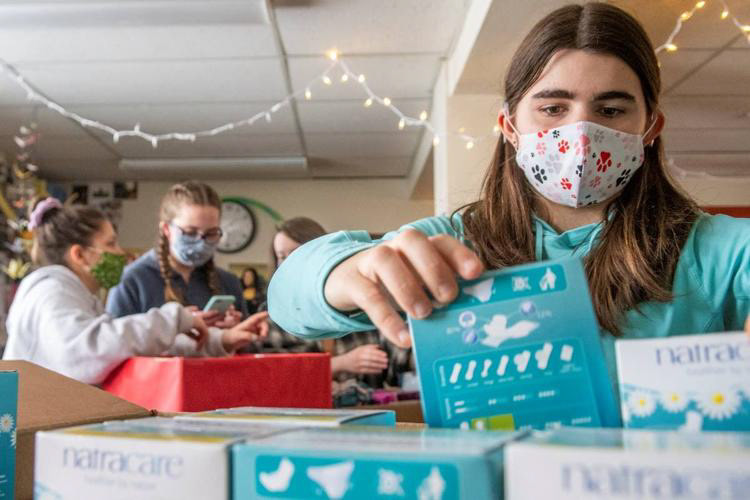
PERIOD @ Moscow High School counting pads collected in a product drive. PC Moscow-Pullman Daily News.
A struggle many members shared was that as trans and nonbinary people, periods caused serious gender dysphoria. Gender dysphoria is discomfort associated with a mismatch between assigned biological sex and gender identity, and can cause anxiety and depression (NHS). The cultural assumption that period are a women's issue exacerbated thatI wanted to design to meet that need.
We started with the question:
What makes buying period products hard for genderqueer people?
Through discussion, we pinned down three important factors.
PC The Telegraph
Language
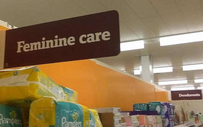
Most period products are branded as "feminine hygiene," and gynecology is called "women's health." Euphemisms for periods include "Bloody Mary," "girl flu," and "Aunt Flo." These words assume that people who menstruate or women, and can make genderqueer people feel dysphoric.
PC Walmart
Graphics
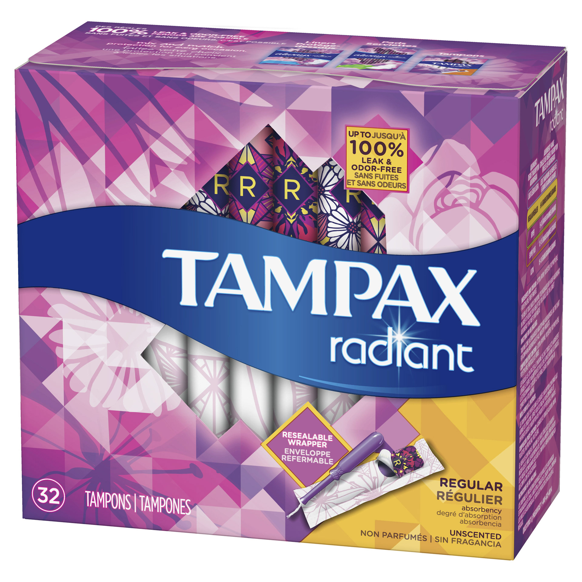
My friends were annoyed by how pink and sparkly tampons are. Like gendered language, stereotypically feminine color palettes and floral designs assume the people who use tampons are women.
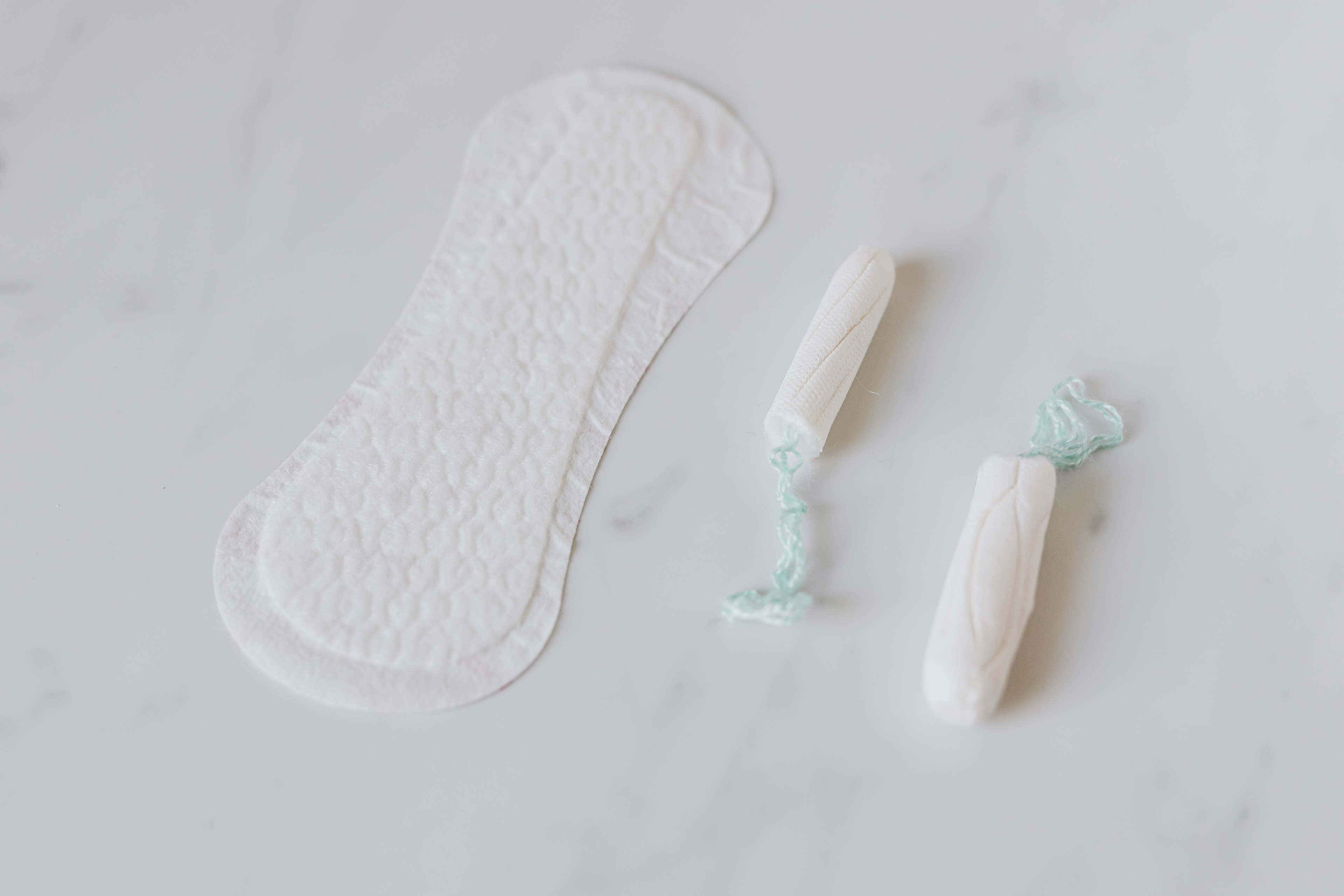
PC Karolina Grabowska
Transparency
Some of the trans people I spoke to bought store brand period products, since store brand packaging tends to be less flashy, and therefore less feminine. However, ingredient transparency isn't required for period products and cheaper products often don't list ingredients. Many store brand tampons contain harmful undisclosed chemicals like bleach. These genderqueer users were choosing between gender validation and product transparency.
The Solution
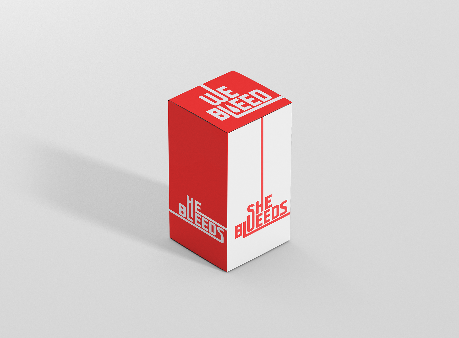
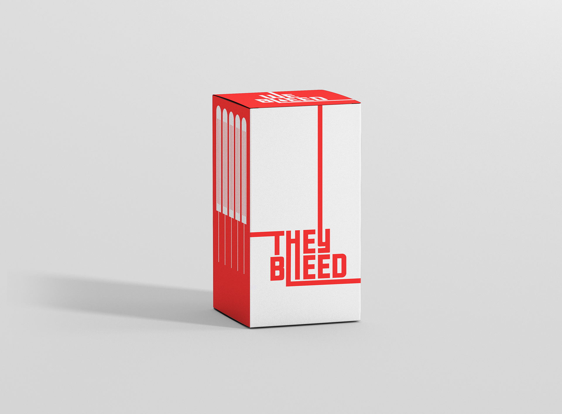
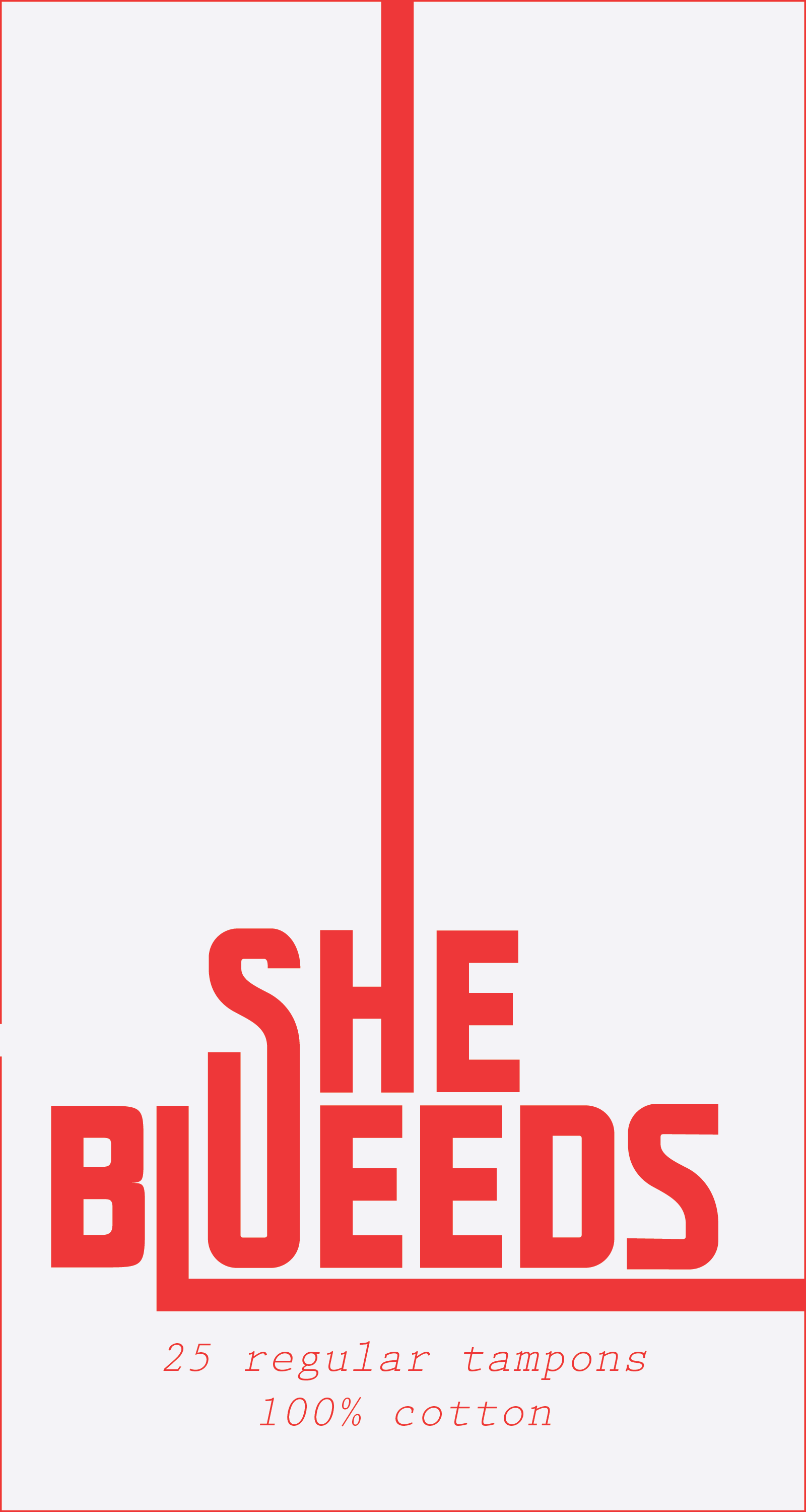
The brand name, "We Bleed" trades gendered euphemisms like "feminine hygiene" for a literal description of what the product is used for: bleeding! The pronoun "we" emphasizes the inclusivity of the product.
I used a minimal color palette of reds and whites to reflect actual period products in use. The simple graphics, blood drops and tampons, are images of periods, rather than any one person who has them.
100% cotton ingredient labels are on each of the main four faces of the box, guaranteeing product transparency.


We Bleed tampons won't be produced in the foreseeable future. It's a project that I'm passionate about, but I'm a designer first and a stressed college student second without enough time left over to be an entrepreneur.
However, I'm still watching We Bleed make an impact. It's started conversations between genderqueer menstruators about their experiences, between menstrual equity activists about intersectionality, and between other designers about what it really means to design inclusively.